Mercator vs Equal Earth Map Projection
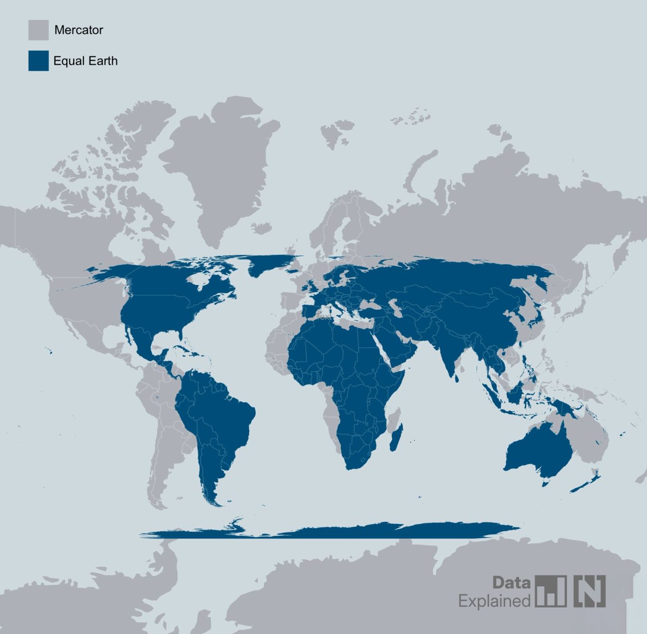
Every flat map of a sphere distorts something — area, shape, distance, or direction — since no projection can preserve all four at once. The Mercator and Equal Earth projections sit at opposite ends of that trade-off: one preserves shape and direction (useful for navigation), the other preserves relative area (useful for comparing the true size of countries and continents).
Mercator Projection
- Created by Flemish cartographer Gerardus Mercator in 1569, originally for maritime navigation.
- A cylindrical, conformal projection — it preserves local shapes and angles, and a straight line on the map is a constant compass bearing (a rhumb line). This is why it became the standard for sea navigation.
- Trade-off: area is massively distorted away from the equator. Distortion is small near the equator but grows toward the poles, becoming infinite exactly at the poles (which is why Mercator maps cut off before reaching them).
- Real-world effect: Greenland appears roughly the same size as Africa on a Mercator map, but Africa's actual land area is about 14x larger. Russia, Canada, and Europe all look larger relative to Africa and South America than they really are.
- Still the default projection for web maps (Google Maps, OpenStreetMap tiles) because local shape preservation and simple north-up orientation matter more than area accuracy at street/city zoom levels — the area distortion is barely noticeable when you're not looking at the whole globe.
Equal Earth Projection
- Created in 2018 by Bojan Šavrič, Bernhard Jenny, and Tom Patterson, as a direct response to the Boston Public Schools' 2017 decision to adopt the older Gall–Peters projection for its equal-area property.
- A pseudocylindrical, equal-area projection: it preserves the true relative size of landmasses, and the equations were deliberately kept simple to implement and fast to compute.
- Improves on the Gall–Peters projection (also equal-area) by avoiding Gall–Peters' extreme vertical stretching near the poles and its generally unfamiliar, elongated continental shapes — Equal Earth's shapes look closer to what people expect from Robinson-style world maps while still being mathematically equal-area.
- Most accurate shapes occur at 40.4°N/S along the central meridian; shapes near the equator get slightly stretched north-south and compressed east-west, and near the poles they stretch east-west (poles render as short lines rather than points).
- Adopted by NASA's Goddard Institute (July 2018) for temperature-anomaly maps, and supported by OpenStreetMap, Mapbox, and Esri ArcGIS Pro.
Comparison
| Projection | Equal-area | Shape/angle accuracy | Typical use |
|---|---|---|---|
| Mercator (1569) | No — high-latitude area heavily inflated | High (conformal) | Navigation, web map tiles |
| Gall–Peters (1855/1967) | Yes | Low — elongated, unfamiliar shapes | Advocacy for accurate-area teaching maps |
| Equal Earth (2018) | Yes | Moderate — closer to natural appearance | Education, scientific/statistical world maps |
| Robinson / Winkel tripel | No (compromise projections) | Better than Mercator, not equal-area | General-purpose atlases (e.g. National Geographic) |
2026 UN Resolution
In September 2026, the UN General Assembly adopted a resolution — "Correct the Map: rebalancing global cartographic representation and promoting equitable representation of the world's regions, particularly Africa" — encouraging wider use of equal-area projections, specifically citing Equal Earth, in contexts where relative size matters (education, media, official publications).
- Vote: 164 in favor, 1 against (United States), 6 abstentions (Estonia, Georgia, Lithuania, Moldova, Serbia, Ukraine).
- Non-binding: it does not require any country or institution to stop using Mercator, which remains dominant for navigation and web mapping.
- Framed by proponents as correcting a distortion that has historically made Africa and the Global South look smaller and less significant than they are.
Mercator Projection
The Mercator projection (/mərˈkeɪtər/) is a cylindrical map projection presented by Flemish geographer and cartographer Gerardus Mercator in 1569. It became the standard map projection for navigation because it is unique in representing north as up and south as down everywhere while preserving local directions and shapes. The map is thereby conformal. As a side effect, the Mercator projection inflates the size of objects away from the equator. This inflation is very small near the equator but accelerates with increasing latitude to become infinite at the poles. As a result, landmasses such as Greenland and Antarctica appear far larger than they actually are relative to landmasses near the equator, such as Central Africa.
https://en.wikipedia.org/wiki/Mercator_projection
https://en.wikipedia.org/wiki/Equal-area_map
See Mercator vs Equal Earth Map Projection for a fuller comparison, including the 2018 Equal Earth projection and the 2026 UN resolution favoring equal-area maps.
Maps Distort How We See the World - by Tomas Pueyo
- India is bigger than greenland
- Russia is not as big as it seems
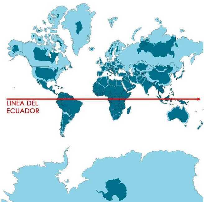
So the Mercator projection clearly distorts our perception of the world. But it’s not the only way it’s distorted. We center our map around the equator and the reference meridian, which goes through London.
What happens if you center it on Argentina instead?
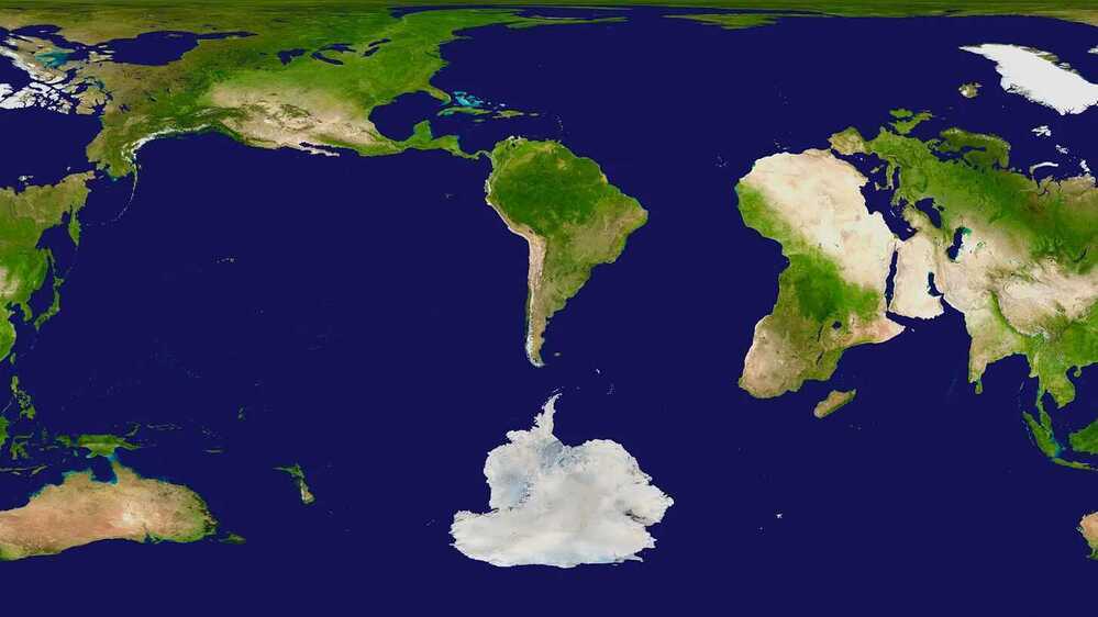
This shows how far away from everything Chile is, at the bottom left of South America. Poor lonely Chile. Your Australian editor Shoni would also want to claim lonely status for New Zealand.
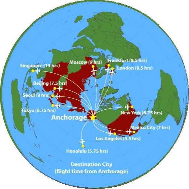
Conversely, if you center the map around Alaska, you can see why it has the 3rd biggest airport in the world in terms of cargo: it’s the most central point to all the big markets in the northern hemisphere.
Links
- Equal Earth projection - Wikipedia
- Mercator projection - Wikipedia
- The True Size Of ... (interactive size comparison tool)
- UN tells the world: Stop making Africa look small - UN News
- General Assembly Adopts Text to 'Correct the Map' - UN Press
- The UN backs a new world map showing Africa in its true relative size - NPR
- Related: Continents has more on how Mercator distorts perception of landmass size and re-centering effects.