Comprehensive Design System Guide
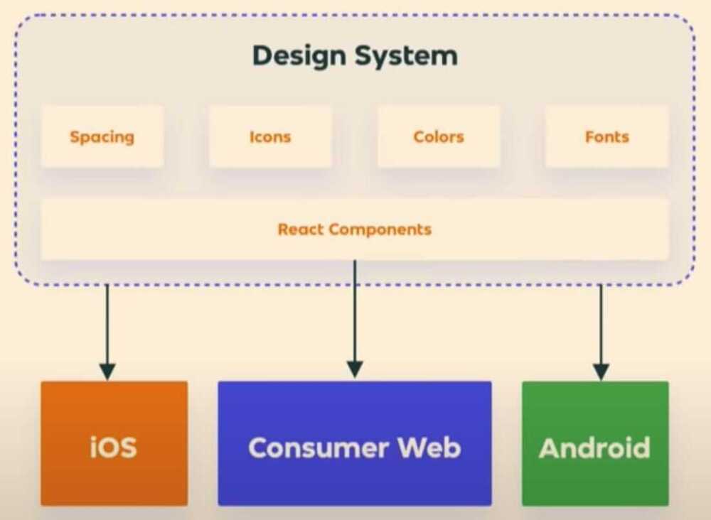
The complete set of design standards, documentation, UI patterns, and components. Design systems allow you to manage design at scale
- Typography
- Layouts and grids
- Colors
- Icons
- Components
- Coding Conventions
- Documentation
- Reusable components
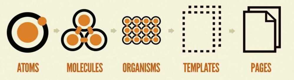
Atomic Design System
Atomic design is methodology for creating design systems. There are five distinct levels in atomic design:
https://bradfrost.com/blog/post/atomic-web-design
https://atomicdesign.bradfrost.com/table-of-contents
Tools
- Frontify
Lona
A tool for defining design systems and using them to generate cross-platform UI code, Sketch files, and other artifacts.
https://github.com/airbnb/Lona
Zeplin
A design delivery tool that helps designers publish files in a format that developers can understand. It's a central hub for build-ready designs that the entire product team can use. Zeplin is good for asset collaboration.
Zeplin vs. Figma Dev Mode: a point-by-point breakdown | Zeplin Gazette
StoryBook
Storybook is an open source tool for developing UI components in isolation for React, Vue, and Angular. It makes building stunning UIs organized and efficient.
Storybook is a development environment for UI components. It allows you to browse a component library, view the different states of each component, and interactively develop and test components.
- https://www.freecodecamp.org/news/what-is-storybook-and-how-can-i-use-it-to-create-a-component-libary-in-react
- https://storybook.js.org
- https://github.com/storybookjs/storybook
Others
- https://patternlab.io - Pattern Lab is a frontend workshop environment that helps you build, view, test, and showcase your design system's UI components.
- https://penpot.app - Penpot is the first Open Source design and prototyping platform meant for cross-domain teams. Non dependent on operating systems, Penpot is web based and works with open web standards (SVG). For all and empowered by the community.
- https://www.invisionapp.com
- Fractal
Color Palette picker
Typography tools
- https://type-scale.com
- https://www.modularscale.com
- https://www.figma.com/best-practices/typography-systems-in-figma
- https://www.figma.com/best-practices/typography-systems-in-figma/typography-scales
- https://jhildenbiddle.github.io/vertical-rhythm-reset
- "Helvetica is the sweatpants of typefaces." -- John Boardley, Graphic Designer
- Course - https://www.freecodecamp.org/news/how-to-design-good-typography
- The 40 Best Google Fonts-A Curated Collection for 2023 · Typewolf
Creating own design system
- https://www.youtube.com/watch?v=LwYZTKxj-do&ab_channel=freeCodeCampTalks
- https://www.invisionapp.com/inside-design/guide-to-design-systems
- https://medium.com/@siw_grinaker/top-12-design-systems-b598368be5a6
- https://www.freecodecamp.org/news/how-to-create-and-implement-a-design-system-with-css
- How to create an effective UX Design System by Ansh Mehra (Hindi)
- Design Debt